Data at Risk report
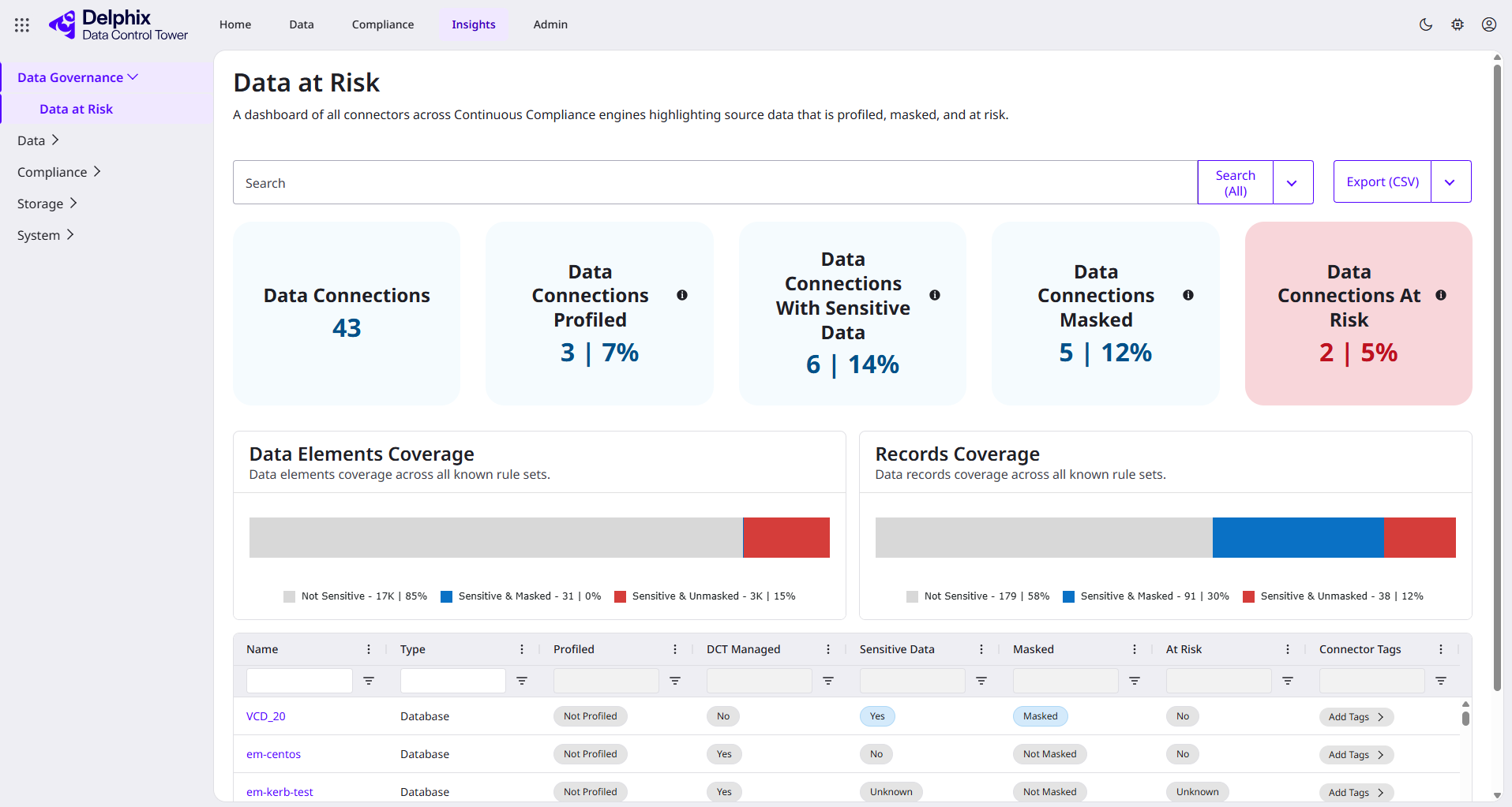
The Data at Risk report gives you a single, global view of every connector configured across Continuous Compliance, and whether each one's sensitive data has actually been identified and masked. The report works from one assumption: any connector carrying sensitive data should end up profiled and masked. Your goal as a data administrator is to use this report to drive the number of at-risk connectors toward zero.
If a connector is flagged as containing sensitive data and you want to understand why, see Identify sensitive data to review how discovery policies and data classifiers determine sensitivity.
If you want to focus on a specific application, team, or part of your organization rather than everything at once, use the search bar and per-column filters above the table. The billboards, charts, and table all update to reflect only the connectors currently matching your search.
This report tells you whether a source connector has been protected. It does not trace where that data goes once it's masked or copied downstream, and it does not compare your profiling and masking coverage against regulatory framework controls such as GDPR or PCI. Perforce Unified Compliance covers that broader picture. This capability is not yet available and is targeted for Q3 2026. If you're interested in learning more, email us at delphix-early-adopters@perforce.com.
Currently, the report only includes database connectors. File and mainframe dataset connectors are not covered and will not appear in the report's UI table.
Dashboard overview
The summary below is a good starting point to share with your CSO or product teams. As a data administrator, use it to build accountability for every connector that is at risk. That is, sensitive data that has not yet been masked or otherwise protected.
-
Global visibility metrics
At the heart of the report are the global visibility metrics, presented through a combination of billboards and charts at the top of the page:-
Billboards: Show data connection counts across five categories.
-
Total number of data connections
-
Data connections with at least one successful profiling job
-
Data connections identified with sensitive data
-
Data connections with at least one successful masking job
-
Data connections at risk (sensitive but not masked)
See Terminology and definitions below for exactly what each of these terms means.
-
-
-
Detailed data insights
-
Charts: The Data Elements Coverage and Records Coverage charts break down, respectively, the count of data elements (e.g., database columns) and records across three categories, listed below. Legends and tooltips provide exact counts and percentages for each category, enhancing the understanding of your data's sensitivity and protection status.
-
Not sensitive
-
Sensitive and masked
-
Sensitive and unmasked
-
-
Terminology and definitions
To help provide clarity and understand the definitions for key terms used within this report, refer to the definitions below.
The billboards above use the term "data connections," but every row in the table below, and everything the report actually measures, is a single connector. Clicking a row's name takes you to that connector's detail page. "Data connection" and "connector" refer to the same thing on this page.
-
Profiled: A connector has undergone a profiling job.
-
Sensitive data: Sensitive data identified within a connector's data elements.
-
Masked: A successful masking job has been run on the connector's data.
-
At risk: Sensitive data within a connector that has not been masked.
-
This is applied to data classified as sensitive (with at least one algorithm assignment), that has not had a successful masking job run. This definition is based on the masking job’s perspective.
-
Data might be refreshed, potentially mislabeling a connector as not at risk despite changes in the actual data. This discrepancy arises because DCT may not detect that the underlying data has been updated, leading to potential inaccuracies.
The Data Elements Coverage and Records Coverage charts each break sensitive data down into the same three states: not sensitive, sensitive and masked, and sensitive and unmasked. Data elements and records tell you different things, though:
-
Data elements are counted at the column level. A high count of sensitive and unmasked data elements tells you the scope of what needs review. It is a measure of effort, not necessarily severity.
-
Records are counted at the row level. This is where actual exposure lives, and it's usually the number regulators and auditors care about. A connector with a large number of sensitive and unmasked data elements can still carry relatively low risk if the number of sensitive and unmasked records is small.
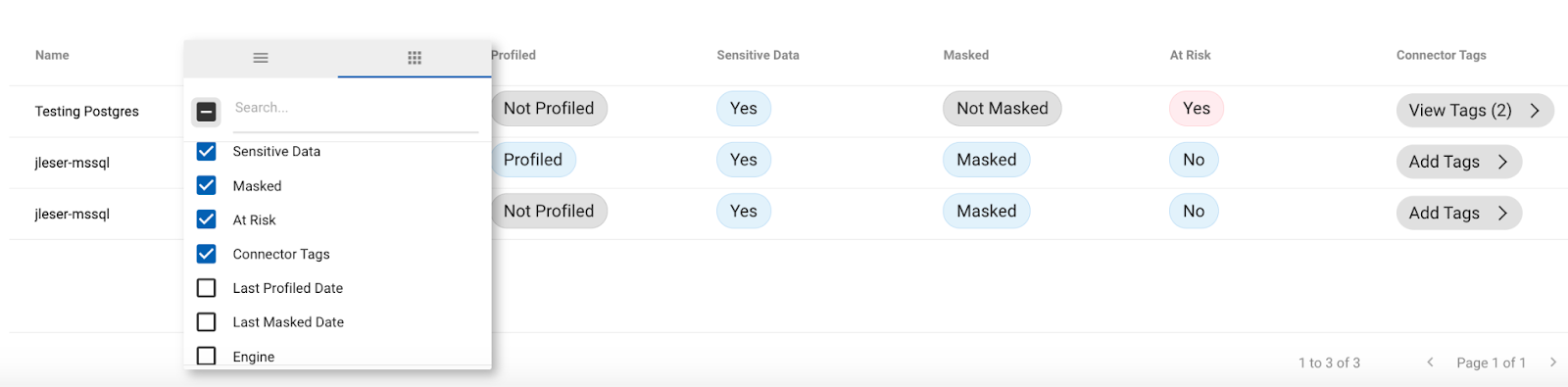
The table below the charts gives you this same column-and-row breakdown per connector, so you can see exactly where to focus. Use the column menu to toggle on additional fields, including per-connector element and record totals split the same way (not sensitive, sensitive and masked, sensitive and unmasked).
Automate this report
Driving your at-risk count toward zero is an ongoing effort, not a one-time check. You can schedule the Data at Risk report for recurring delivery via email using the DATA_RISK_SUMMARY report type, so you can track that number over time without coming back to check the dashboard manually. See Email and schedule weekly DCT reports via API to learn more.